Top 5 Contractor Logo Design Mistakes (And How to Avoid Them)
Top 5 Logo Mistakes Contractors Make (And How to Avoid Them)
Your logo is often the first impression a potential customer has of your business. Whether you’re an HVAC tech, plumber, roofer, or general contractor, your logo should communicate professionalism, trust, and the type of work you do. But too many contractors either rush this step or overlook important design principles.
Below are the top 5 contractor logo design mistakes, and how to fix them if you want your business to stand out and get noticed. We’ll use a fictitious case study – Tom’s Refrigeration – to illustrate some common oversights (and not to offend any real-life examples).
1. Using Clip Art or Generic Symbols
The mistake:
Many contractors settle for generic tools or house icons they find online—like a wrench, hammer, or roof outline. While these are industry-related, they’re overused and don’t make your brand unique or memorable.
Why it hurts:
- Makes your business look unoriginal or cheap
- Fails to differentiate you from dozens of other contractors
- Can lead to trademark issues or copyright violations
How to fix it:
Invest in a custom logo design that reflects your trade and personality. A professional designer will incorporate unique elements, fonts, and layout styles that are tailored to your business and audience—not just downloaded from a stock site.
2. Poor Font Choices

The mistake:
Using hard-to-read or overly stylized fonts can make your business name difficult to recognize at a glance—especially on yard signs, trucks, or social media profiles.
Why it hurts:
- Affects readability from a distance
- Gives off an unprofessional or outdated vibe
- Confuses potential customers
How to fix it:
Choose bold, legible fonts that balance style and clarity. Your font should reflect your industry (e.g., bold and tough for concrete work, sleek for electricians) and be easy to read at any size.
3. Too Many Colors or Effects
The mistake:
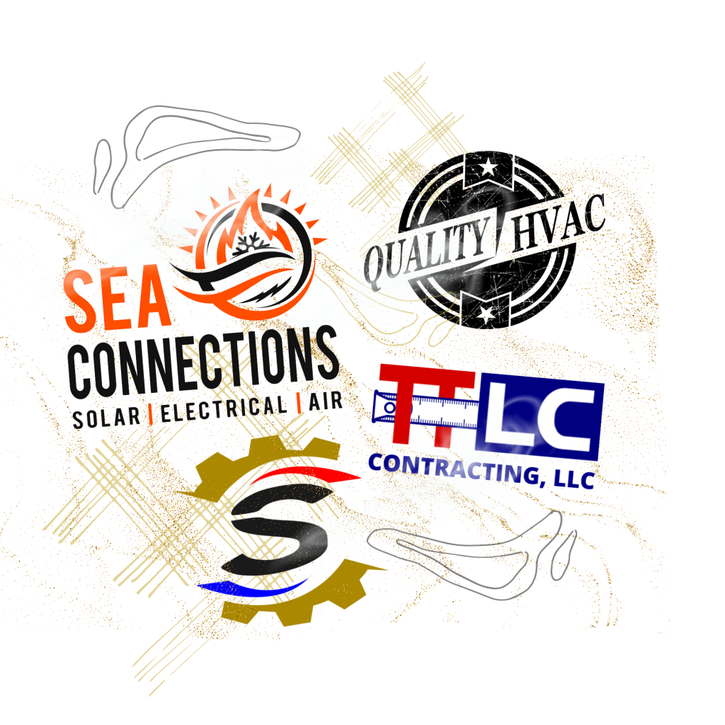
Some contractor logos include gradients, drop shadows, metallic effects, or five different colors—all in one design.
Why it hurts:
- Harder to print or embroider consistently
- More expensive for shirts, vehicles, or signs
- Looks cluttered or outdated
How to fix it:
Stick to 2–3 core colors that are consistent with your brand. Flat colors (no effects or gradients) print better and scale well. A strong logo should look good in color, black and white, and on any background.
4. Overcomplicating the Design

The mistake:
Trying to cram too much detail—like tools, buildings, flags, initials, and full taglines—into one logo.
Why it hurts:
- The logo loses impact when shrunk (especially on shirts or website headers)
- Confuses the viewer instead of leaving a lasting impression
- Makes your brand feel disorganized
How to fix it:
Simplify. A clean, well-balanced logo with one or two core elements is more memorable and versatile. You can always create alternate versions (like a horizontal logo for your truck and a simplified icon for social media).
5. Ignoring Your Brand Personality

The mistake:
Creating a logo that doesn’t match your business tone. For example, a high-end custom home builder with a cartoonish logo, or a tough roofing crew with a dainty script font.
Why it hurts:
- Confuses potential customers
- Doesn’t reflect your target audience
- Weakens your overall branding
How to fix it:
Think about how you want customers to feel when they see your logo: Do you want to appear strong and dependable? Precise and high-end? Affordable and fast? A good designer can guide you to a logo style that speaks directly to your ideal client.
Final Thoughts: Build a Brand, Not Just a Logo
Your logo is more than a pretty design—it’s the foundation of your brand. A smart investment in the right logo now will save you time, money, and missed opportunities later.
Whether you’re starting a new business or rebranding an existing one, avoid these mistakes and make sure your logo works as hard as you do.
Need help with your contractor logo?
At R.L. Roberts II Design, we specialize in custom logo design for HVAC, plumbing, roofing, and construction companies. We understand the trades and create logos that build trust, look great on trucks, and help you win more jobs.
Your logo is the face of your business—it helps customers recognize and remember you. A poor logo can make you look unprofessional or untrustworthy.
If your logo is hard to read, overly detailed, outdated, or looks like your competitors’, it may be working against you instead of building recognition.
Yes. A professionally designed logo creates trust, improves brand recall, and looks great across trucks, uniforms, signs, and your website.
While quick tools are tempting, they often create generic, low-quality logos. Custom designs ensure your brand stands out and speaks to your target market.
It varies based on quality and customization. Expect to invest anywhere from $250 to $1,000+ for a strong logo that works across all branding.
A great contractor logo is bold, readable from a distance, easy to print, and matches your company’s tone—whether it’s high-end, affordable, or tough.
Yes. A good logo package includes versions for light/dark backgrounds, social media, trucks, shirts, and a simplified version for small prints.
Absolutely. A strong logo makes your business look more legit and can be the difference between someone calling you—or scrolling past.


